CSS3 filters render visual effects similar to Photoshop filters in the browser. Filters can be added not only to images, but also to any non-empty elements.
The set of filters is not limited to those preinstalled in the browser. You can also use SVG filters by downloading them from the link along with the svg element.
Filters were originally created as part of the SVG specification. Their task was to apply effects based on the pixel grid to vector graphics. With browser support for SVG, it became possible to use these effects directly in browsers.
Browsers process the page pixel by pixel applying the specified effects and render the result on top of the original. Thus, by applying several filters, you can achieve different effects, as if they are superimposed on each other. The more filters, the longer it takes the browser to render the page.
You can apply multiple filters at the same time. The classic way to apply these effects is when hovering over a :hover element.
Browser SupportIE: not supported
Edge: 13.0 except url()
Firefox: 35.0
Chrome: 18.0 -webkit-
Safari: 9.1, 6.0 -webkit-
Opera: 40.0, 15.0 -webkit-
iOS Safari: 9.3, 6.1 -webkit-
Android Browser: 53.0, 4.4 -webkit-
Chrome for Android: 55.0, 47.0 -webkit-
| blur() | The value is specified in units of length, such as px , em . Applies a Gaussian blur to the original image. The larger the radius value, the greater the blur. If no radius value is specified, it defaults to 0 . |
| brightness() | The value is specified in % or in decimal fractions. Changes the brightness of the image. The larger the value, the brighter the image. The default value is 1 . |
| contrast() | The value is specified in % or in decimal fractions. Adjusts the image contrast, i.e. difference between the darkest and lightest areas of the image/background. The default value is 100% . A value of zero will hide the original image under a dark gray background. Values increasing from 0 to 100% or 0 to 1 will gradually open the original image to the original display, and values above will increase the contrast between light and dark areas. |
| drop shadow() | The filter acts like the box-shadow and text-shadow properties. Uses the following values: x-offset y-offset blur stretch shadow color. A distinctive feature of the filter is that the shadow is added to the elements and its content, taking into account their transparency, i.e. if the element contains text inside, then the filter will add a shadow for both the text and the visible borders of the block. Unlike other filters, this filter requires parameters to be specified (the minimum is the offset value). |
| greyscale() | Extracts all the colors from the picture, making the output black and white. The value is specified in % or decimal fractions. The larger the value, the stronger the effect. |
| hue-rotate() | Changes the colors of the image depending on the specified rotation angle in the color wheel. The value is given in degrees from 0deg to 360deg . 0deg is the default value, meaning no effect. |
| invert() | The filter makes the image negative. The value is given in %. 0% applies no filter, 100% fully converts colors. |
| opacity() | The filter works similarly to the opacity property, adding transparency to an element. The distinguishing feature is that browsers provide hardware acceleration for the filter, which improves performance. An added bonus is that the filter can be combined with other filters at the same time, creating interesting effects. The value is only given in % , 0% makes the element completely transparent, and 100% has no effect. |
| saturate() | Controls the saturation of colors, working like a contrast filter. A value of 0% removes the color, while 100% has no effect. Values from 0% to 100% decrease color saturation, while values above 100% increase color saturation. The value can be given as a % or as an integer, 1 is equivalent to 100% . |
| sepia() | An effect that imitates antiquity and "retro". A value of 0% does not change the appearance of the element, while 100% reproduces the full sepia effect. |
| url() | The function accepts the location of an external XML file with an svg filter, or an anchor to a filter that is in the current document. |
| none | Default value. Means no effect. |
| initial | Sets this property to its default value. |
| inherit | Inherits the property value from the parent element. |
CSS properties have reached such a level of development that they are able to cope with some important functions of image editors. An example of this is CSS filters, which can be used to create beautiful effects for images.
If earlier it was difficult to even imagine it, now almost all software filters are implemented in the cascading table, from blurring to artistic color models.
However, CSS filters have one small drawback - not all web browsers support visual effects. Of course, it's only a matter of time. And by the time the “x” hour arrives, developers need to be ready. In the meantime, consider what has already been implemented at the moment.
Browser Support for CSS FiltersBasically, all popular browsers, Firefox, Chrome, Opera, have a "friendly" relationship with filter effects. What can not be said about IE, which completely refuses to support effects, even in the latest versions.
| Version | no | 31+ | 35+ | 7+ | 18+ | 4.4+ | 6+ |
| filter | — | (-webkit-) | + | (-webkit-) | (-webkit-) | (-webkit-) | (-webkit-) |
All CSS properties have some parameters that combine the order in which values are written. The filter property is no exception, like the others, it can use a combination of multiple rules in a single application. For example, add a brightness filter for the image, and specify another one through the space - contrast. We will cover everything in this article with a few examples for better understanding.
Syntax
Filter: filter name (value percentage) ; filter: url(img.svg); filter: blur(10px); filter: brightness(0.9); filter: contrast(150%); filter: drop-shadow(5px 5px 10px black); filter: grayscale(80%); filter: hue-rotate(60deg); filter: invert(80%); filter: opacity(50%); filter: saturate(50%); filter: sepia(40%); /* Apply multiple filters */ filter: contrast(150%) grayscale (80%);
List of filters
| blur(px) | Filter to blur the image. The amount of blur is specified in pixels. If no number is given, the default is 0. |
| drop shadow() | Shadow. An alternative to the box-shadow property with similar parameters and the same spelling order. The exception is the fourth value "stretch": almost all browsers do not support it. |
| gray scale (%) | Desaturate filter. Applies shades of gray to the image based on the specified percentage. A negative value is not allowed, and the originality of the picture is 0. |
| brightness (%) | Adjust the brightness of the image. A value of 100% shows the original brightness point. Adjustment is made both negatively (-50%) and positively (150%). |
| contrast (%) | Adjust the image contrast. As with the previous filter, a value of 100% will show the origin point. Changes can be set negative (-20%) and positive (120%). |
| hue-rotate (deg) | Rotary color tone overlay. Depending on the specified degree (from 0deg to 360deg), the color will be adjusted to the image, which is determined by the color wheel. |
| invert (%) | Image inversion. A value between 0 and 100% is applied with no negative parameter. |
| saturation (%) | Image saturation. The home position is defined as 100% and has no negative value. |
| sepia (%) | Sepia effect. The originality of the picture is defined as 0% and is available up to 100% without negation. |
| opacity (%) | Image transparency. Another filter that has a similar opacity property with the same uses. The setting is allowed from 0 to 100% without a negative parameter. |
| url() | CSS link to an SVG element with a specific #id. |
| initial | Sets the default value of a property. |
| inherit | Inherits all property values of its parent element. |
We have come to the interesting part of the article, in which we will consider each filter separately with examples of its application. For clarity, three pictures will be used. The first will show the starting point, the appearance of originality. The second will serve as a static example in applying the filter, and the third will show the hover effect, hovering the mouse over the image.
blur filterIn graphic editors, the blur filter is an indispensable tool and is often used in work. It is able to not only create a blurry image, but to make the effect of focusing on a certain element, while the rest of the image falls under the blur. And much more.
In the design of the site (for example - blur) can be used as a lining for better readability of the text located in the picture. Actually, the blur is performed in a Gaussian manner from the value of 0 px and until it disappears completely.
Original
Filter
hover effect
/*static rule*/ .efbl1 img( filter: blur(2px); -webkit-filter: blur(2px); ) /*for hover effect*/ .efbl2 img( transition: all 0.6s ease 0s; ) . efbl2:hover img( filter: blur(4px); -webkit-filter: blur(4px); transition: all 0.6s ease 0s; )
shadow filterThe shadow property came to us with the third version of the cascading table. Of course, it is familiar to everyone involved in website building, since box-shadow plays an important role in design. The drop-shadow filter can be called an inferior alternative with similar parameters, and there are only 5 of them, not counting the inner shadow.
The order of writing is: 5px/-5px (horizontal offset), 5px/-5px (vertical offset), 15px (shadow blur radius), 5px/-5px (shadow stretch), black (color). The filter supports all syntax except stretching and inset value (inner shadow), as well as adding multiple shadows separated by commas. But despite all this, there are advantages, for example, the filter takes into account pseudo-elements, which allows you to display the exact shape of the element's shadow.
Also interesting is that when the box has no background, but only a border stroke, then when using box-shadow, a shadow will be displayed supposedly taking into account the background, that is, solid. And in the case of using drop-shadow, the shadow takes the form of a stroke without regard to the background.
Original
Filter
hover effect
/*static rule*/ .efdrswd1 img( filter: drop-shadow(6px 7px 3px rgba(0, 0, 0, 0.4)); -webkit-filter: drop-shadow(6px 7px 3px rgba(0, 0, 0 , 0.4)); ) /*for the hover effect*/ .efdrswd2 img( transition: all 0.6s ease 0s; ) .efdrswd2:hover img( filter: drop-shadow(6px 7px 3px rgba(0, 0, 0, 0.4)); -webkit-filter: drop-shadow(6px 7px 3px rgba(0, 0, 0, 0.4)); transition: all 0.6s ease 0s; )
Decolorization filterClassic photography style for all time in the right direction. The filter allows only one value - positive. Depending on the specified percentage, grayscale will smoothly replace the color of the image. Also, instead of percentages, you can use a fraction up to a whole number (0.01/1).
Original
Filter
hover effect
/*static rule*/ .efgrays1 img( filter: grayscale(90%); -webkit-filter: grayscale(90%); ) /*for hover effect*/ .efgrays2 img( transition: all 0.6s ease 0s; ) .efgrays2:hover img( filter: grayscale(90%); -webkit-filter: grayscale(90%); transition: all 0.6s ease 0s; )
Brightness filterAdding light to the "unexplored" black corners of the image. It is often used in photo processing, since amateur shots, as a rule, are taken in poorly lit places. The brightness of the filter is adjustable from 0% (completely black picture) to almost complete disappearance of the image. The original point is defined as 100%, and the value can also be specified as a fraction.
Original
Filter
hover effect
/*static rule*/ .efbrig1 img( filter: brightness(150%); -webkit-filter: brightness(150%); ) /*for hover effect*/ .efbrig2 img( transition: all 0.6s ease 0s; ) .efbrig2:hover img( filter: brightness(150%); -webkit-filter: brightness(150%); transition: all 0.6s ease 0s; )
Contrast filterA simple way to make an image more expressive is to experiment with the brightness settings of the lightest and darkest parts of the picture. The contrast filter is here to help. Its parameters, like many others, exclude a negative value (-150%), and the initial position is indicated at 100%. In addition to percentages, a fraction (1.5) is also allowed.
Original
Filter
hover effect
/*static rule*/ .efcontr1 img( filter: contrast(150%); -webkit-filter: contrast(150%); ) /*for hover effect*/ .efcontr2 img( transition: all 0.6s ease 0s; ) .efcontr2:hover img( filter: contrast(150%); -webkit-filter: contrast(150%); transition: all 0.6s ease 0s; )
Color tone filterAn excellent design technique in the design of the image, under the style of the main design of the resource. The bottom line is to overlay the shade of the selected color on the original image. The ratios come out depending on the specified degree, which indicates the color point on the color wheel.
If the value is positive (150deg), then the rotation is clockwise. Accordingly, if negative, then counterclockwise. In two positions it starts from 0deg to 360deg.
Original
Filter
hover effect
/*static rule*/ .efhrotai1 img( filter: hue-rotate(180deg); -webkit-filter: hue-rotate(180deg); ) /*for hover effect*/ .efhrotai2 img( transition: all 0.6s ease 0s; ) .efhrotai2:hover img( filter: hue-rotate(180deg); -webkit-filter: hue-rotate(180deg); transition: all 0.6s ease 0s; )
Filter inversionA specific effect that allows you to turn the color of an image upside down. In graphic editors, it has a certain role and it happens that without its participation it is not possible to achieve the desired result. The invert filter parameter is indicated only in the positive direction from the value of 0% to 100%.
Original
Filter
hover effect
/*static rule*/ .efinve1 img( filter: invert(100%); -webkit-filter: invert(100%); ) /*for hover effect*/ .efinve2 img( transition: all 0.6s ease 0s; ) .efinve2:hover img( filter: invert(100%); -webkit-filter: invert(100%); transition: all 0.6s ease 0s; )
Saturation filterWhen an image loses its natural color for unknown reasons (something like a faded T-shirt in the sun), then increasing the saturation can instantly restore the previous look. And if this filter is used in combination with other filters, the result will be very satisfactory. The setting is made from 0 initial form, to large numbers.
Original
Filter
hover effect
/*static rule*/ .efsatut1 img( filter: saturate(165%); -webkit-filter: saturate(165%); ) /*for hover effect*/ .efsatut2 img( transition: all 0.6s ease 0s; ) .efsatut2:hover img( filter: saturate(165%); -webkit-filter: saturate(165%); transition: all 0.6s ease 0s; )
Sepia filterImitation of the effect of old photographs (slightly brown tint). In this way, a retro image style is achieved, which is especially popular. The sepia filter is adjustable from 0% (home position) to 100%.
Original
Filter
hover effect
/*static rule*/ .efsepiaa1 img( filter: sepia(100%); -webkit-filter: sepia(100%); ) /*for hover effect*/ .efsepiaa2 img( transition: all 0.6s ease 0s; ) .efsepiaa2:hover img( filter: sepia(100%); -webkit-filter: sepia(100%); transition: all 0.6s ease 0s; )
Filter transparencyThe filter is similar to the opacity property from the 3rd version cascading table. The syntax is the same, but the transparency value is adjustable from 0% to 100% (original position).
Original
Filter
hover effect
/*static rule*/ .efopaty1 img( filter: opacity(50%); -webkit-filter: opacity(50%); ) /*for hover effect*/ .efopaty2 img( transition: all 0.6s ease 0s; ) .efopaty2:hover img( filter: opacity(50%); -webkit-filter: opacity(50%); transition: all 0.6s ease 0s; )
Link filterA custom filter is created based on SVG elements with a specific ID, which can later be used in CSS through a link filter. Effects can be very different from standard filters, ranging from mask-overlay to banal transparency.
CSS filters generatorIt has long been customary to create generators of various CSS properties. , and many many others. They serve as a tool that simplifies the work. And for novice webmasters, they can be of double benefit. They are very easy to use: move the sliders, and the result is immediately visible. And at the end, it remains only to copy the generated code. The same goes for CSS filter generators. Here are two of them for your reference:
Conclusion
The review turned out to be quite rather big, but I hope that it will be useful to someone in practice. Also don't forget to combine filters, one is good, but two will be better in certain cases.
We have learned how to collect data on the client and send it to the server. And on the server, they wrote a stub in the place where the goods filtered by the entered parameters should be returned. Now we will get rid of the stub and write a couple of methods and queries that pull the necessary products from the database and return them to the client. The lesson is quite short. Getting Started
What do we do?We only need to complete 3 steps:
- 1. Get data from the client and process it according to the needs of the server. For example, set the default parameters
- 2. Write, in fact, the code itself for extracting goods from the database. First of all, prepare the sql query
- 3. Return the received data to the client
You may ask: why is it necessary to separate this simple operation separately, if we can easily pull out all the data from the $_GET array?
First, in order to put down the default values. You can't rely on the client to take care of it.
Second, not all data is in $_GET in a usable form. For example, it is more convenient for us to pass sorting from the client as a single parameter in the form of a field_direction, for example, price_asc. But in the sql query, these are separate entities, so they need to be pre-processed.
The situation is similar with brands. On the client, we send them as an array of brands, and php receives them as an array as well. But the sql query needs a string - a list of brands separated by commas. Therefore, brands also need to be further processed.
So, let's write the getOptions() function, which will pull the data from $_GET and transform it into a form convenient for us. I have already reported almost all the introductory ones, so we immediately look at the finished code.
// Getting data from the _GET array function getOptions() ( // Category and prices $categoryId = (isset($_GET["category"])) ? (int)$_GET["category"] : 0; $minPrice = ( isset($_GET["min_price"])) ? (int)$_GET["min_price"] : 0; $maxPrice = (isset($_GET["max_price"])) ? (int)$_GET["max_price" ] : 1000000; // Brands $brands = (isset($_GET["brands"])) ?implode($_GET["brands"], ",") : null; // Sort $sort = (isset($ _GET["sort"])) ?$_GET["sort"] : "price_asc"; $sort = explode("_", $sort); $sortBy = $sort; $sortDir = $sort; return array(" brands" => $brands, "category_id" => $categoryId, "min_price" => $minPrice, "max_price" => $maxPrice, "sort_by" => $sortBy, "sort_dir" => $sortDir); )
Here we see that we first get the category id. If the category is not passed, we consider category_id = 0. The minimum price will be 0, the maximum price will be 1 million. If your online store sells plutonium (oil to the Chinese, ants by the piece), then you can always add zeros to the desired line or, at worst, make payments in euros.
Sorting is done in a different way. Separately, we pull out the sort field and the parameter: asc or desc.
Please note that in all cases we do not forget to substitute the default value if the required parameter did not come from the client. And now, when all the data has been converted, all that remains is to return it from the function in an associative array via return array(...)
Preparing an sql query and extracting data from the databaseAll the data is prepared in the form we need, now let's write a query and execute it. This will be done by the getGoods($options, $conn) function. As parameters, it takes $options - the data prepared by the previous function, and $conn - the database connection object that we created in the previous lesson. Our task is to write an sql query. In general, it looks like this:
Select g.id as good_id, g.good as good, b.brand as brand, g.price as price, g.rating as rating, g.photo as photo from goods as g, brands as b where g.category_id = selected_category and g.brand_id in (comma_separated_brand_list) and g.brand_id = b.id and (g.price between min_price and max_price) order by sort_field sort_direction
We retrieve the required fields by applying a series of where conditions and specifying the desired sort. There are no questions about prices and sorting, we just substitute the necessary values in the appropriate places of the request. But you need to be more careful with the category and brands, and here's why.
Each product we have always has a category. There is no concept of a zero category in our database - we did it for our own convenience, in order to understand that the user did not select any category in the browser (or chose all - for us it is the same thing). And in this case, we should not include the line in the query
g.category_id = selected_category and
The same is with brands, if they are not selected, then we skip the corresponding line. Here's what it looks like in code.
// Getting goods function getGoods($options, $conn) ( // Required parameters $minPrice = $options["min_price"]; $maxPrice = $options["max_price"]; $sortBy = $options["sort_by"] ; $sortDir = $options["sort_dir"]; // Optional options $categoryId = $options["category_id"]; $categoryWhere = ($categoryId !== 0) ? " g.category_id = $categoryId and " : " "; $brands = $options["brands"]; $brandsWhere = ($brands !== null) ? " g.brand_id in ($brands) and " : ""; $query = " select g.id as good_id , g.good as good, b.brand as brand, g.price as price, g.rating as rating, g.photo as photo from goods as g, brands as b where $categoryWhere $brandsWhere g.brand_id = b.id and (g.price between $minPrice and $maxPrice) order by $sortBy $sortDir "; $data = $conn->query($query); return $data->fetch_all(MYSQLI_ASSOC); )
First, we extract the price and sort variables from the $options array - they are simply inserted into the query without modification. And for the category and brands, we form the $categoryWhere and $brandsWhere strings according to the principle: the necessary condition for the where section, if there is data, and an empty string if there is no data. Thus, we got a fairly sane sql-query that takes into account all our wishes. The last two lines execute this query and return an array of objects with the required fields from the function. It remains to collect everything in a heap and send the received goods back to the already waiting client / browser.
We return goods to the clientThis is the easiest part of the tutorial. Let's look at the stub written in the previous lesson.
// Connect to the database $conn = connectDB(); // Return a successful response to the client echo json_encode(array("code" => "success", "data" => $_GET));
Let's replace this code with
// Connect to the database $conn = connectDB(); // Get data from the client $options = getOptions(); // Get the goods $goods = getGoods($options, $conn); // Return a successful response to the client echo json_encode(array("code" => "success", "options" => $options, "goods" => $goods));
We added a couple of lines: using the getOptions function, we retrieved the data into the $options variable. We immediately used it in getting goods getGoods, the results were saved in $goods. And expanded the response to the client. The data parameter was renamed to options and returned not the contents of $_GET, but already converted values. And in the goods parameter, we returned an array of received goods.
This lesson is over. While we cannot use this data on the client, render it in the browser - we will deal with this in the next lesson. But we can always open the console, poke buttons and checkmarks and make sure that the server returns us the correct goods.
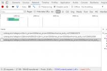
Checking the results of workLet's select the category Smartphones and mark the brands Apple and Samsung. In the response, we will see that the server returned 3 products, sorted by price ascending 
Now let's set the minimum price to 20 thousand and change the sorting to price descending  As you can see, now there are only 2 products - one Samsung was discarded due to an unsuitable price for filters of 17 thousand. And the goods are sorted already on the contrary. If you did everything correctly, you will see exactly the same picture.
You can still play with the console and make sure that the data is returned correctly. In the end, the most important thing is to get the filters working properly, returning the correct list of products. Scattering the received data on the page, taking into account the already finished layout, is outwardly the most interesting thing, but from the point of view of development it is quite simple. But I will not get ahead of myself - the details are in the next lesson.
Using the :checked pseudo-class, you can toggle the states of elements such as checkboxes or radio buttons. In this tutorial, we'll explore this CSS3 property by creating an experimental portfolio filter that toggles the states of certain types of elements.
This lesson was inspired by Roman Komarov's brilliant experiment "Filtering elements without JS", in which he uses checkboxes and radio buttons to filter colored forms.
HTML markupLet's start with markup. Our goal is to create four filter buttons, after clicking on which, the corresponding portfolio items will appear or disappear. So we'll be using multiple radio buttons, all of which have the same name, since they must belong to the same group (so only one radio button will have the "checked" state). By default, we want all radio buttons to be selected or checked. We'll add some label tags for the radio buttons, which we'll use to hide the radio buttons. Clicking on the label will select the radio button with the corresponding id:
All
web design
Illustration
icon design