You may have heard expressions such as "8-bit" And "16-bit". When people mention bits, they are talking about how many colors are in an image file. Photoshop's color modes determine the bit depth of an image (1, 8, 16, or 32 bits). Since you will be working with these characteristics quite often (for example, when in the dialog box New you also have to choose the number of bits), it is useful to know what these numbers mean.
Bit is the smallest unit of measurement used by computers to store information. Each pixel in an image has bit depth which controls how much color information a given pixel can contain.
So bit depth image defines how much color information the given image contains. The greater the bit depth, the more colors can be displayed in the image.
Let's take a quick look at the options with different number of bits in Photoshop.
1. In color mode, pixels can only be black or white. Images in this mode are called 1-bit, because each pixel can only be one color - black or white.
2. 8-bit image can contain two values in each bit, which equals 256 possible color values. Why 256? Since each of the eight bits can contain two possible values, you get 256 combinations.
With 256 combinations for each channel in an RGB image, you can have over 16 million colors.
3. 16-bit images contain 65536 colors in one channel. They look the same as other images on the screen, but take up twice as much hard drive space. These images are very popular with photographers because the complementary colors give them more flexibility when adjusting their settings. Curves And Levels, even though larger file sizes can greatly slow down the program.
In addition, not all tools and filters work with 16-bit images, but the list of tools that work with them grows with each new version of the program.
4. 32-bit images, which are referred to as High Dynamic Range (HDR) images, contain more colors than you might think. But this will be discussed in future articles about HDR.
Basically, you will be dealing with 8-bit images, but if you have a camera that takes higher bit depth images, by all means, take a day off and experiment to see if it's worth sacrificing space for the difference in quality. hard disk and editing speed.
Noticed an error in the text - select it and press Ctrl + Enter . Thanks!
Digital cameras, or at least professional digital cameras, have had the ability to shoot in RAW format for several years now, allowing you to open images in Photoshop and edit them in 16 bit instead of 8 bit as you normally would with standard JPEG images.
Despite this, many photographers, even professional ones, still take their pictures in JPEG format, even if their camera supports RAW format. And while there are very few weighty arguments when choosing JPEG versus RAW - high shooting speed and much smaller file sizes are the first that come to mind - many people still shoot in JPEG simply because they do not understand the difference between editing images in 16 bit mode. In this lesson, we will just analyze this difference.
What does the term "8 bits" mean?
You must have heard the terms 8 bits and 16 bits before, but what do they mean? When you take a picture with a digital camera and save it as a JPEG, you are creating a standard 8-bit image. The JPEG format has been around for a long time with the advent of digital photography and even during the development of Photoshop, but lately its shortcomings have become more and more noticeable. One of them is the inability to save a JPEG file in 16-bit format, because it simply does not support it. If it's a JPEG image (with the ".jpeg" extension), it's an 8-bit image. But what does "8 bit" mean anyway?
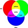
If you've read our RGB and Color Channels tutorial, you know that every color in a digital image is created from a combination of three primary vibrant colors - Red(red), green(green) and blue(blue):
It doesn't matter what color you see on the screen. It was still made from some combination of those three colors. You might be thinking, “That's impossible! My image has millions of colors. How can you create a million flowers from just red(red), green(green) and blue(blue)?
Good question. The answer lies in mixing shades of red, green and blue! There are many shades of each color that you can work with and mix with each other, more than you can imagine. If you had pure red, pure green, and pure blue, then all you can create is seven different colors, including white if you mix all three colors together.

You can also include an eighth color here, black, which you would get if you completely removed the red, green, and blue.
But what if you have, say, 256 shades of red, 256 shades of green, and 256 shades of blue? If you make mathematical calculations, 256x256x256 \u003d 16.8 million. Now you can create 16.8 million flowers! And that, of course, is what you can get from an 8-bit image - 256 shades of red, 256 shades of green, and 256 shades of blue gives you the millions of possible colors you would normally see in a photo:

Where does the number 256 come from? So 1-bit has a value of 2. When you move from 1 bit, you find the value using the expression "2 to the power of (number of subsequent bits)". For example, to find the value of 2 bits, you need to calculate "2 to the power of 2" or "2x2", which equals 4. So 2 bits equals 4.
A 4-bit image would be "2 to the power of 4", or "2x2x2x2", which gives us 16. Therefore, 4 bits equals 16.
We will do the same for an 8 bit image, which will be "2 to the power of 8", or "2x2x2x2x2x2x2x2", which gives us 256. That's where the number 256 comes from.
Don't worry if this seems confusing, incomprehensible, or boring to you. This is just an explanation of how a computer works. Just remember that if you save an image as a JPEG, you are saving it in 8bit mode, which gives you 256 shades of red, green, and blue, 16.8 million possible colors.
So, 16.8 million colors might seem like a lot. But they say that everything is known in comparison, and if you have not compared this with the number of possible colors in a 16-bit image, then you can say that you have not seen anything yet.
As we just figured out, when we save a photo as a JPEG, we get an 8-bit image, which gives us 16.8 million possible colors.
It seems like a lot, and it is, if you think that the human eye can't even see that many colors. We can distinguish only a few million colors, at best, with certain skills, a little more than 10 million, but by no means 16.8 million.
Therefore, even an 8-bit image contains many more colors than we can see. Why then do we need more colors? Why is 8 bits not enough? So, we'll come back to this a little later, but first, let's look at the difference between 8-bit and 16-bit images.
Previously, we figured out that an 8-bit image gives us 256 shades of red, green, and blue, and we got this number using the expression "2 to the power of 8" or "2x2x2x2x2x2x2x2", which equals 256. We will do the same calculations for to find out how many colors we can get in a 16 bit image. All we need to do is find the value of the expression "2 to the power of 16" or "2x2x2x2x2x2x2x2x2x2x2x2x2x2x2x2", which, if you calculate on a calculator, is 65,536. This means that when we work with a 16-bit image, we have 65,536 shades of red , 65,536 shades of green and 65,536 shades of blue. Forget about 16.8 million! 65536 x 65536 x 65536 gives us 281 trillion possible colors!
Now you might be thinking, “Wow, that’s great, but you just said that we can’t even see the 16.8 million colors that an 8-bit image gives us, are these 16-bit images that give us so important? trillions of colors we can't see?"
When it comes time to edit our images in Photoshop, this is really important. Let's see why.
Editing in mode (mode) 16 bits.
If you have two identical photos, open them in Photoshop, the difference should be that one image should be in 16-bit mode with its trillions of possible colors, and the other in 8-bit mode with its 16.8 possible colors. You must have thought that the 16 bit version of the image should look better than the 8 bit version because it has more colors. But the obvious fact is that many photographs simply do not contain 16.8 million colors, let alone trillions of colors to accurately reproduce the content of the image.
They usually contain a few hundred thousand colors at best, although some can reach several million depending on their content (and also depending on the size of the photo, since you need millions of pixels to see a million colors). Plus, as you already know, the human eye can't see at least 16.8 million colors. This means that if you place two 8-bit and 16-bit images side by side, they will look the same to us.
So why is it better to work with 16-bit images? One word - flexibility. When you edit an image in Photoshop, sooner or later if you keep editing it you will run into problems. The most common problem is known as aliasing, where you lose so much detail in an image that Photoshop can't render smooth transitions from one color to another. Instead, you get a terrible staggered effect between colors and their tonal values.
Let me show you what I mean. Here are two simple black and white gradients I created in Photoshop. Both gradients are the same. The first one was created as an 8 bit image. You see the number 8 circled in red at the top of the document window, which indicates that the document is open in 8-bit mode:

And here is the exact same gradient created as a 16-bit image. There are no differences other than the fact that the document title says 16-bit mode, both gradients look the same:

See what happens when I edit them. I'm going to apply the same changes to both gradients. First, I'll press Ctrl+L (Win) / Command+L (Mac) to invoke Photoshop's adjustment. Levels(Levels), and without getting into the details of how levels work, I just move the bottom black and white sliders output values(Output) towards the center. Again, I'll do this with both gradients:

Moving the lower black and white sliders of the Output Values (Output) towards the center in the Levels dialog box ( Levels ).
Essentially, I've taken the full range of gradients from pure black on the left to pure white on the right, and squashed them into a very small segment in the center that ends up being mid-tones of gray. I didn't actually change the gradient. I just concentrated his tonal range in a very small space.
Click OK to exit the dialog box Levels(Levels) and now let's look at the gradients again. Here is an 8 bit gradient:

And here is a 16 bit gradient:

Both gradients after correction with Levels(Levels) now look like solid gray, but they still look the same even though the top gradient is in 8-bit mode and the bottom one is 16-bit. See what happens when I apply again Levels(Levels) to stretch the tonal range of the gradient back to pure black on the left and pure white on the right. I will move the black and white sliders Input values(Input) dialog box Levels(Levels) towards the center, this time to distribute the dark parts of the gradient back to pure black on the left and the light parts back to pure white on the right.

Moving Input Values ( Input ) black and white sliders towards the center to distribute the dark parts of the gradient back to pure black on the left and the light parts back to pure white on the right.
Let's look at our two gradients again. The first is an 8 bit gradient:

Ouch! Our anti-aliased black and white gradient no longer looks like it! Instead, it has the "stepped" effect that I was talking about, where you can easily see how the grayscales change one after another, and this is because we lost a huge part of the image details after making those adjustments that we did with levels(Levels). So the 8-bit image didn't do the job very well. Let's see what happened to the 16 bit image:

Look at him! Even after the big adjustments I made with Levels(Levels), 16-bit gradient did the job without a single blot! Why is that? Why did an 8 bit gradient lose so much detail, but a 16 bit one didn't? The answer lies in what we have talked about up to this point. An 8-bit image can only contain a maximum of 256 shades of gray, while a 16-bit image can contain up to 65,536 shades of gray. Even though both gradients looked the same at the beginning, the 16k extra grays give us more flexibility during editing and the likelihood of any problems later on. Of course, even 16 bit images eventually get to a point where they start to lose a lot of detail and you will see problems after a lot of image editing, but in 8 bit images this point comes faster, and with 16 bit we can deal with much longer. .
Let's try this time to consider the same things using an ordinary photo as an example.
Editing a photo in (mode) 16 bit
Let's try the same editing experiment on a full color photo. I took the beach ball photo we saw on the first page. Here is the image in standard 8 bit mode. Again we see the number 8 at the top of the document window:

And here is the same photo, but in 16-bit mode:

Both images look the same at the moment, as do those two gradients.
The only difference between the two is that the top image is 8 bit and the bottom image is 16 bit. Let's try to make the same adjustments using Levels(Levels). Right now I'm editing the image in an extreme way, which is certainly not what you usually do with your images. But this way will give you a clear idea of how much we can damage an image if it is in 8-bit mode compared to the slight damage that occurs when editing a 16-bit version of an image.
I press Ctrl+L (Win) / Command+L (Mac) again to bring up the dialog Levels(Levels), and move the sliders output values(Output) at the bottom towards the center, at the same point as in the case of gradients. I do the same again with both images: 8 bit and 16 bit versions of the images:

Moving the white and black sliders of the Output Values ( Output ) toward the center in the Levels dialog box.
Here's what an 8-bit image looks like after concentrating the tonal range into the small space where you would normally find midtone information:

And here is what a 16-bit image looks like:

Again, both versions are identical. There are no visible differences between the 16 bit and 8 bit versions.
Now let's call Levels(Levels) and set the tone values back so that the dark areas become pure black and the light areas become pure white:

Moving the black and white slider of the Input Values ( Input ) toward the center in the Levels dialog box to center the dark areas of the image in black and the light areas in white.
Now let's see if there is any difference between the 16 bit version and the 8 bit version. For starters, 8 bits:

Oh no! As with the gradient, the 8-bit image suffered some pretty decent damage through editing. There is a very noticeable shift in color, especially on the water, which looks like some sort of painting effect rather than a full color photo. You can also see the damage on the beach ball as well as the sand at the bottom of the photo. So far, the 8-bit image has been of little use.
Let's see what happened to the 16-bit image:

Again, just like with the gradient, the 16-bit version was left untouched! Every bit remained the same as before editing, while the 8 bit image lost a lot of detail. And this is all because the 16 bit version has such a huge number of possible colors at its disposal. Even after the hard impact I did, I couldn't do any visible damage to the image thanks to the 16-bit mode.
So how can you take advantage of a 16 bit image? Just. Always take pictures in RAW format instead of JPEG (of course, if your camera supports raw), then open and edit it in Photoshop as a 16-bit image. Keep in mind that when you're working with a 16-bit image, it's larger than an 8-bit image, and if you have an older computer, it can take a while to process your photo in Photoshop. Also, despite the fact that new versions of Photoshop are getting better and better in this regard every time, not every filter is available for image correction in 16-bit mode, but most of the main ones work. If you want to work in 8 bit mode, go to the menu Image(Image) at the top of the screen and select Mode(Mode), and then select 8 bits. Try to work in 16-bit mode for as long as possible before switching to 8-bit mode. Also make sure you switch to 8bit mode before printing the image, or even save your 16bit version of the image as a Photoshop .PSD file and then save a separate 8bit version for printing.
Today, technologies and devices make it possible to make an image so bright and saturated that it will be even more beautiful than its real prototype. The quality of the transmitted image depends on several indicators at once: the number of megapixels, image resolution, its format, and so on. One more property belongs to them - color depth. What is it, and how is it defined and calculated?
General information
Color depth is the maximum number of shades of color that an image can contain. This number is measured in bits (the number of binary bits that define the color of each pixel and hue in the image). For example, one pixel with a color depth of 1 bit can take on two values: white and black. And the more important the color depth is, the more diverse the image will be, including many colors and shades. She is also responsible for the accuracy of the image transmission. Everything is the same here: the higher, the better. As another example, an 8-bit GIF would have 256 colors, while a 24-bit JPEG would have 16 million colors.
A bit about RGB and CMYK
As a rule, all images of these formats have a color depth of 8 bits per channel (color). But in the image there can be several color channels. Then the RGB pattern with three channels will already have a depth of 24 bits (3x8). The color depth of CMYK images can be up to 32 bits (4x8).

Some more beats
Color depth is the number of shades of a single color that an imaging device can reproduce or create. This parameter is responsible for the smoothness of the transition of shades in the images. All digital images are encoded with ones and zeros. Zero - one - white. They are stored and contained in memory, measured in bytes. One byte contains 8 bits, in which the color depth is indicated. For cameras, there is another definition - the color depth of the matrix. This is an indicator that determines how complete and deep images in terms of shades and colors are capable of producing a camera, or rather its matrix. Due to the high value of this parameter, the photos are voluminous and smooth.

Permission
The link between color depth and image quality is its resolution. For example, a 32-bit image with a resolution of 800x600 will be significantly worse than a similar one with a resolution of 1440x900. Indeed, in the second case, a much larger number of pixels are involved. This is pretty easy to verify for yourself. All you need to do is go to the "image settings" on your PC and try to reduce or increase sequentially. During this process, you will clearly see how much the resolution affects the quality of the transmitted picture. No matter how many colors an image includes, it will be limited to the maximum that the monitor can support. As an example, take a monitor with a color depth of 16 bits and an image with 32 bits. This image on such a monitor will be displayed with a color depth of 16 bits.
Color depth
Color depth(color quality, image bit depth) is a computer graphics term that means the amount of memory in the number of bits used to store and represent color when encoding one pixel of a raster graphics or video image. Often expressed as a unit bits per pixel (English bpp - bits per pixel) .
- 8-bit image. With a large number of bits in the color representation, the number of displayed colors is too large for the color palettes. Therefore, at a large color depth, the luminances of the red, green and blue components are encoded - such encoding is an RGB model.
- 8 bit color in computer graphics, a method of storing graphic information in RAM or in an image file, when each pixel is encoded with one byte (8 bits). The maximum number of colors that can be displayed at the same time is 256 (28).
8-bit color formats
indexed color. IN indexed (palette ) mode, any 256 colors are selected from a wide color space. Their meanings R, G And IN are stored in a special table - a palette. Each pixel in an image stores a color value in the palette, from 0 to 255. 8-bit graphics formats effectively compress images with up to 256 different colors. Reducing the number of colors is one of the lossy compression methods.
The advantage of indexed colors is high image quality - a wide color gamut is combined with low memory consumption.
Black and white palette. 8-bit black and white image - from black (0) to white (255) - 256 grayscale.
uniform palettes. Another format for representing 8-bit colors is a description of the red, green and blue components with a low bit depth. This form of color representation in computer graphics is commonly referred to as 8-bit. true color or uniform palette uniform palette) .
12-bit color color is encoded in 4 bits (16 possible values) for each R-, G-and B -components, which allows you to represent 4096 (16 x 16 x 16) different colors. This color depth is sometimes used in simple devices with color displays (such as mobile phones).
highcolor, or highcolor, designed to represent the full range of shades perceived by the human eye. Such a color is encoded with 15 or 16 bits, namely: a 15-bit color uses 5 bits to represent the red component, 5 for green and 5 for blue, i.e. 25 - 32 possible values for each color, which gives 32,768 (32 × 32 × 32) combined colors. A 16-bit color uses 5 bits to represent red, 5 bits to represent blue, and (because the human eye is more sensitive to green tones) 6 bits to represent green—respectively 64 possible values. 65,536 (32 × 64 × 32) colors in total.
LCD Displays . Most modern LCDs display 18-bit color (64 x 64 x 64 = 262,144 combinations). Difference from truecolor- displays is compensated by pixel color flickering between their nearest 6-bit colors and (or) imperceptible to the eye dithering (English) dithering ), in which the missing colors are made up of the available ones by mixing them.
Truecolor 24 bit image. Truecolor provides 16.7 million different colors. This color is closest to human perception and is convenient for image processing. 24 bit true color -color uses 8 bits to represent red, blue and green, 256 different color representations for each channel, or a total of 16,777,216 colors (256 × 256 × 256).
32-bit color is an incorrect description of the color depth. 32-bit color is 24-bit ( Truecolor ) with an additional 8-bit channel that determines the transparency of the image for each pixel.
SVRX-Truecolor. In the late 1990s some high-end graphics systems have begun to use more than 8 bits per channel, such as 12 or 16 bits.
The bitness of the image is a frequent question. We tell you which option to prefer and why more bits are not alwaysOK.
The standard opinion on this matter is that the more bits, the better. But do we really understand the difference between 8-bit and 16-bit images? Photographer Nathaniel Dodson explains the differences in detail in this 12-minute video:
More bits, Dodson explains, means you have more freedom to work with colors and tones before various artifacts appear in the image, such as banding (“banding”).

If you're shooting in JPEG, you're limiting yourself to a bit depth of 8 bits, which allows you to work with 256 color levels per channel. The RAW format can be 12-bit, 14-bit or 16-bit, with the latter providing 65,536 levels of colors and tones, giving you much more freedom in post-processing. If you count in colors, then you need to multiply the levels of all three channels. 256x256x256 ≈ 16.8 million colors for an 8-bit image and 65 536x65 536x65 536 ≈ 28 billion colors for a 16-bit image.
To visualize the difference between an 8-bit and a 16-bit image, think of the former as a building that is 256 feet tall—that's 78 meters. The height of the second “building” (16-bit photo) will be 19.3 kilometers – these are 24 Burj Khalifa towers stacked one on top of the other.

Note that you can't just open an 8-bit image in Photoshop and "turn" it into 16-bit. By creating a 16-bit file, you give it enough "space" to store 16 bits of information. By converting an 8-bit image to 16-bit, you get 8 bits of unused "space".
 JPEG: no detail, poor color, RAW: not much detail
 But the extra depth means a larger file size - meaning the image will take longer to process and also require more storage space.
Ultimately, it all depends on how much freedom you want to have in post-processing your shots, as well as the capabilities of your computer.