In this tutorial, we'll learn how to increase the contrast and color saturation of an image in unique and creative ways by applying blend modes to individual color channels in a photo. If you're a Photoshop user, you'll know that we usually select blend modes from the Layers palette because they're most commonly used to change how a layer interacts with or blends with the layer(s) below. Here we will go further and learn how to apply the same blending modes not to the entire layer, but only to one of the individual layers. RGB (Red, Green And Blue) channels that Photoshop uses to create a color image. How will we apply blend modes to color channels? You'll see that it's actually very easy, thanks to Photoshop's Apply Image(External channel).
Working with channels in Photoshop is too broad a topic to cover in this article. I'll touch on them briefly here and we'll move on, but I recommend you read the separate articles on RGB channels if you're new to them.
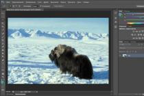
For this tutorial, I'll be using Photoshop CS6, but earlier versions will work. Here is the original photo:

The first thing we need to do before starting work is to create a copy of our image. If you look at the screenshot of my layers palette, you can see that the original photo is on the background layer:

Duplicate the background layer using the keyboard shortcut Ctrl+Alt+J. Photoshop will not only create a copy of the layer, but also open a dialog box new layer(New Layer) where we can name the layer before it is added. Name the layer, for example “ Apply Image”, then press OK:

If we now take a look at the layers palette, we can see a copy of the image located on a layer called “ Apply Image”, right above the background layer. It's important to give your layers meaningful names, otherwise we'll end up with a bunch of layers with Photoshop-generated names like “ Layer 1″ which tell us nothing about the contents of the layer:

As I mentioned at the beginning of the article, we most often choose blend modes in the Layers palette, since they usually apply to the entire layer. Drop-down menu Blend Mode(Blend Mode) is located in the upper left corner of the layers palette. For example, I'll change the layer's blend mode Apply Image from Normal(Normal) on soft light(Soft light):

We have changed how the layer Apply Image interacts with the background layer below. soft light(Soft light) - one of contrast blend modes because it increases the overall contrast of the image, as we can see in our photo example. Color saturation has also been slightly boosted:

I'll change the blend mode back to Normal(Normal) to return it to its original state:

So, if changing the blend mode in the layers palette is so important for blending layers, where are those individual color channels, and how do we use blend modes with them? Regarding the first part of the question, if you look at the top of the Layers palette, you will see that it is grouped with the other two panels - Channels(Channels) and Paths(Outlines) - and each panel is presented as a tab at the top. Click on the tab Channels(Channels):

You will switch to the panel Channels(Channels) where you can see individual Red, Green And Blue the color channels that make up your image. RGB the channel at the top isn't really even a channel, but the result of combining the Red, Green, and Blue channels, or in other words, what you see as a full-color version of our image (each color in the image is a specific combination of red, green, and blue):

We can select an individual color channel by simply clicking on it. I'll choose the Red Channel:

Selecting the red channel temporarily disables the Green and Blue channels and allows us to see only it in the window. Photoshop renders the color channels as halftone images, and each channel looks different. Below you can see what my red channel looks like in the document window. If you compare this black and white version with the original full color photo, you will notice that areas that had a lot of red in the full color version are lighter in the black and white version, while areas with little or no red appear darker. :

Then, I will select the Green channel in the panel Channels(Channels), which will temporarily disable the Red and Blue channels:

The Green channel is now displayed in the document window as a grayscale image. Please note that it is very different from the Red Channel. Again, if you compare the channel to the original image, you'll notice that the areas that contain a lot of green will be lighter in it, and vice versa:

Finally, I will select on the panel Channels(Channels) only the Blue channel, which will turn off the Red and Green:

And now we see in the document window the Blue channel, which again gives us a picture that is very different from the other two channels. This time, the more blue an area contained in the original version of the image, the lighter it will be in the grayscale version, while areas containing little blue will be darker. When we select an individual color channel in the dialog box Apply Image(Outer Channel), which we'll get to shortly, keep in mind that these are actually different grayscale versions of the image, with different brightness values than the image we see initially:

To switch back to the full color version of the image, click on the channel RGB at the top of the panel Channels(Channels). This will turn all three channels back on:

So we're back to viewing the full color version of the image again:
 The full color version of the image reappeared in the document window.
Apply Image Function (External Channel)
Now that we know where to find the color channels and what each of them looks like as a halftone image, let's get back to the second part of the question - how can we apply blend modes to them? You may have noticed that there is no option Blend Mode(Blending Mode) at the top of the panel Channels(Channels), as was the case with the panel Layers(Layers). In fact, we don't even need an open panel Channels(Channels), so let's switch back to the layers palette by clicking on its tab:
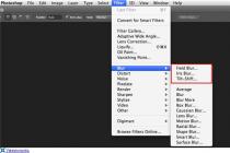
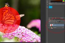
To apply a blend mode to an individual color channel, we use the function Apply Image(External channel). Go to menu Image(Image) and select Apply Image(External channel):

A dialog box will open Apply Image(External channel). It might scare you a little if you've never used it before, but what we're going to do here is quite simple. In fact, we will only use two options − Channel(Channel) and Blending(Overlay):

Drop down menu Channel(Channel) we select the color channel we want to use. Selected by default RGB, this, if you remember, is the same composite RGB channel that we saw at the top of the panel Channels(Channels) (it mixes the Red, Green and Blue channels to create a full color image). Drop down menu Blending(Overlay) we choose the blend mode we want to use. If we leave the option Channel(Channel) set to RGB and just select the blend mode from the menu Blending(Overlay), we get the same result as if we set the blending mode on the layers palette. For example, I'll choose the blend mode soft light(soft light) for option Blending(Overlay) ( Channel(Channel) set to RGB):

And here we can see that the image is no different from what it was when I selected the blend mode soft light(Soft light) on the layers palette earlier. We get the same contrast and saturation boost:

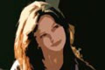
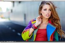
Now the fun begins. For option Channel(Channel), we can choose from three individual color channels. I'll leave the Blending option set to soft light(soft light) but change the value Channel(Channel) with RGB on the Red(Red) so I'll only overlay the red channel:

This time, we get a different result. We still see contrast boost with blend mode soft light(Soft light), but since only the Red channel halftone we saw earlier is superimposed, we get a different effect. The woman's skin looks much lighter than before. The same can be seen on her hair, along with a red T-shirt, and red, orange, and yellow jacket fragments. Basically, everything containing warm red tones is now lighter. Likewise, cool areas without red, such as the blue and green parts of the jacket, appear darker than before:

Let's see what happens if I select the Green channel (the blend mode is still soft light):

With the green channel selected, we get a different effect. Now the areas containing green are lighter, while red and blue are darker. The most obvious difference is in the skin, which is now darker and more detailed than with the red channel:

And finally, the Blue channel:

Here we see the third variation of the effect, blue areas appear light and warm tones appear dark. We would not have been able to achieve these variations of the effect (at least without a lot of time and extra effort) if it were not for the individual color channels, which Photoshop gives us control through the function Apply Image(External channel):
Of course, we're not limited to just using the blend mode. soft light(Soft light) when working with channels. We can use any of the blending modes that we usually choose in the layers palette. I will leave the option Channel(Channel) set to Blue(Blue) and change Blending(Overlay) with soft light(soft light) on overlay(Overlap):

Like soft light, overlay(Overlay) - A contrast blend mode, but with a stronger, more intense result:

That's what gives us the same mode overlay if we change the value Channel (Channel) from Blue to Green:

Well, this is what the Red channel looks like in Overlay mode:

Red channel in mode overlay(Overlay) looks too contrasty and saturated, but if needed we can tone down the effect simply by lowering the opacity of the overlay. You will find the Opacity option right below the Opacity option. Blending(Overlay), it works just like the opacity slider on the layers palette. The default value is 100%. I'll lower it to 60%:

By lowering the opacity, we brought back some detail in the shadows and highlights:

If at some point you want to compare the result with the original version of the image, just uncheck preview(View) on the right side of the dialog box. This will hide the effect and show you the original photo in the document window. Check the Preview box again to show the effect again:

Over time, especially when working with photographs of people, you will notice that the blend modes soft light(soft light) and overlay(Overlap) will give the best results, but there are other useful modes such as Screen(Screen) and Multiply(Multiplication). Screen(Screen) brightens the image while Multiply(Multiplication) - darkens. Try using them with each of the three color channels to find the best option, then adjust the result by reducing or increasing the opacity of the overlay. For example, in the image below, I have selected the green channel, blending mode Multiply(Multiply), and lowered the opacity to 40%:

The result is a darker, more detailed image:

When you are happy with the result, click OK to close the window Apply Image(External channel). Now you can compare what you got with the original image by hiding the layer Apply Image in the layers panel:

So now you know how to apply blend modes to individual color channels using the function Apply Image(Outer Channel) in Photoshop! We wish you creative success, stay with us and follow the updates on the site.
I recently read a translation of an article on channels in Photoshop on a "famous" site. The article emphasized that Photoshop does not distinguish colors, and sees all images in black and white. Photoshop shows color images because we “expect” to see them in color, and he quietly adds some kind of numbers, thanks to which magic happens. On what the logic of such reflections is built is not clear. Whether on the fact that the old versions of Photoshop showed the channels as black and white prints, or on something else. Not surprising are the questions in the comments in the style of, “wow, so it turns out from a black and white photo you can make a color one?”
For that matter, Photoshop doesn't see anything at all. Photoshop is just a program written by a human in a programming language. Photoshop does not see either gray or white, red or green. Photoshop navigates the graphics like Neo in the Matrix. He sees pixels as a bunch of zeros and ones, and makes decisions based on digital parameters. Photoshop is nothing more than changing digital values, the values are converted into colors that the human eye can recognize. In other animals, the eyes are arranged differently, and they apparently need some other Photoshop, but so far this has not grown together.
It is also not clear where, finally, our domestic accessible and understandable articles about Photoshop, color, printing, where are our Dans Margulis. The entire Runet translates Western designers and graphic teachers. It seems that we have long had both the design itself and good designers, and the only known writer on the Runet so far, Artemy Lebedev, and even then, writes about something of his own. In this article, I will try to uncover the issue of channels, going through the basics of the emergence of light and color along the way. We will go through the whole logic of the appearance of colors on the screen from beginning to end and I assure you that by the end you will understand the essence of the channels in Photoshop no worse than Dan Margulis. I'll start with the basics and tell you how color comes into existence. What is the difference between light and color. This is very important for a correct understanding of the channels. Moreover, I will try to cover not only RGB channels, but also CMYK and LAB channels.
Photoshop color space and channels
Let's agree right away: channels and color space are not the same thing. If we are talking about channels, then we are talking about channels. Not about RGB channels or CMYK channels. What is a color space in Photoshop? Color space is the essence, the formula by which Photoshop assembles an image. Channels directly depend on the color space in which Photoshop works. If the color space is RGB, then these are 3 RGB channels, if the color space is CMYK, then these are other channels, channels for the CMYK color space. But there are many color spaces, and each has its own channels! It turns out the theme is bottomless? Margulis only scribbles primers one by one in Lab space, but we have just an article. It's not all that scary. Having understood how the channels of one color space are arranged, the others are easily understood. Therefore, we will start with channels in RGB, but first we will charge ourselves with theory.
Color space in Photoshop switches to Image > Mode. If you go to this menu, you will see a series of color spaces in which Photoshop can work. This Bitmap, Grayscale, Duotone, Indexed Color, RGB, CMYK, Lab and Multichannel. Accordingly, in each of these modes there are some channels, arranged in their own way. The channels themselves for any image can be viewed on the channels panel Windows > Channel. By opening this panel you will see the channels themselves, and their final result. In a number of color spaces, you will find only one channel. Others, such as CMYK, have four channels. If filters do not work for you, selection areas are not copied, some colors are not included, graphics are not imported from one window to another - urgently check the color mode. Most likely, the image does not have a typical color mode, like CMYK or Indexed Color.
I will say even more. If you opened a black and white image, it is very possible that its color mode is Grayscale, if you opened a GIF banner saved from the Internet, its color mode is Indexed Color, since the GIF format is saved only in this mode. If you have a large TIFF file on hand, check the mode, most likely it is CMYK, since TIFFs are usually saved for printing in offset, and the color mode for printing in offset is CMYK. And only one color mode always wins. All filters work in it, colors are displayed, graphics are copied. This color mode is truly the king of modes, since Photoshop itself is designed to work with it. And the name of this mode is RGB. And most of the images, photos, and other graphics you'll work with will have this color mode. And that's why.
Monitors and RGB
RGB (Red- Red, Green- green, Blue- blue) is the most common color model because the basis of any modern screen luminous devices contains the RGB color model. Yes, Photoshop can simulate any color space, from CMYK to Lab, but ultimately what we see on the screen is converted to RGB anyway. We are working in Photoshop, on the agenda is a printed TIFF file, CMYK color space, four channels with paint in the Chanel channel panel. But when displaying the workspace, the monitor converts them to RGB. Why?

This is how monitors are arranged, this is how almost all luminous screen devices are arranged. And then you will understand why. Ultimately, everything depends on the ability of the monitor, in principle, to reproduce some colors. In its hardware capabilities, in the quality of its matrix and color gamut coverage. Whatever color space we choose to work with in Photoshop, the monitor shows it using RGB. The monitor shows colors as best it can, as good and bright as the quality of the matrix in it. So we all rest against our piece of iron on the table in the end. You can work with excellent color profiles, in flexible color spaces with wide color gamut, but all to no avail if the monitor is bad.
light and color
Reversing Locke's statements, there is light and there is color. And light has color. This topic is not the subject of our article, but is necessary for a proper understanding of channels in Photoshop. And especially RGB and CMYK channels. What is light? Light is part of electromagnetic radiation. This is a natural phenomenon that is on a par with other electromagnetic radiations such as infrared rays, x-rays, microwaves and ultraviolet. All of them (electromagnetic radiation) are measured in nanometers (nm). Light is measured at 400-700nm, and I think you've already guessed why. Why is it within a radius of 400 to 700. Is it different? Exactly. And its difference is determined by its color.

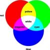
Light rays of different colors are measured by different numbers of nanometers, where purple is drawn at 400nm, green at 550nm, and red at 700nm. When light is refracted in a prism, it breaks down into its component colors: red, orange, green, cyan, indigo, and violet. Every schoolchild knows this from physics lessons. And based on all that has been said, we can draw simple conclusions that will help us understand the RGB channels:
- white "light" is the totality of all colors of the spectrum
- black "light" is the absence of light at all.
- gradually adding all the colors of the spectrum to each other "lightens" the light until it becomes white
- the gradual removal of parts of the spectrum "darkens" the light until there is none left.

Surface color
The color of the surface is arranged differently, but tied to the light. We see the color of objects because objects reflect the light falling on them. Different surfaces have different reflectivity. If a certain surface does not reflect light at all, but absorbs all the rays of the spectrum, then we see black. And what else can you see if the object does not reflect light? If the surface reflects all the rays of the spectrum, we see white. For example, paper reflects all the rays of the spectrum and we see it as white. The moon is white because it reflects the light of the sun, and not because it itself glows purely Samsung Led TV.

Further more. If, for example, a certain surface absorbs all the rays of the spectrum except blue, then this surface looks blue, since it reflects only the blue part of the spectrum. If an object reflects only one part of the spectrum, for example red, then we see it as red. If it reflects the devil, and absorbs the devil, then we see the devil. For example, a surface might reflect some yellow, some blue, some green, and absorb everything else. All other, “not pure” colors consist of this confusion. They are formed by mixing the reflected rays of the spectrum. Perhaps this is enough of the theory of color and light. Let's move on to the channels themselves in Photoshop.
Channels in Photoshop for RGB
From pure theory, let's move on to channels in Photoshop. When creating monitors, smart people did not reinvent the wheel. The monitor emits light. The developers took advantage of what mother nature offered us and created RGB. How is it arranged? It consists of 3 channels: red (Red), green (Green) and blue (Blue). When superimposed on each other, the 3 original colors create the composite colors magenta, cyan and yellow. Together, the familiar rainbow or spectrum is obtained.

The three RGB channels act on each other in the same way that the rays of the spectrum act on each other. When superimposed on each other, a white color is achieved. In the absence of all channels, it turns out black, which is logical. Either light or darkness. In the absence of one of the channels, one of the composite colors (magenta, cyan or yellow) is obtained. Each RGB channel has a value scale from 0 to 255, where 0 is no light and 255 is the maximum possible light. In our case, this is not white light, but the light of one of the channels, blue, green or red. When all three channels are crossed, taking into account the fact that each channel can have a color gradation, from black to the lightest possible, the entire multi-million color palette in RGB is obtained.

I have been thinking for a long time how it would be more successful to depict the superposition of color channels on each other, but in such a way as to take into account the gradation of each channel to black, that is, to the absence of light. After some unsuccessful experiments, I depicted them as a flower. And although this flower does not show all the possible shades of RGB colors, it does a good job of showing how RGB mixes channels.
RGB channels as a mask option in Photoshop
So what do we know about channels? Already enough. We know that there are three channels in the RGB color space, blue, red and green. We know that composite colors are formed when superimposed on each other, and that each channel has a lightness and darkness parameter from 0 to 255. It's time to consider how an image is generated in RGB.
I open Photoshop, choose a nice photo and turn on the channels. If you don't know where they are, open Windows > Channels. I will also use the panel info And color. They can also be found on the menu. Windows. By turning on the channel panel, you will probably see the following picture: one color image, and 3 separate channels with black and white masks, which indicate the degree of illumination of each particular area of the photo by a particular channel. If the area on the image is black, then this channel is completely absorbed by the surface, if it is light, it is completely reflected, if it is gray, it is partially absorbed and partially reflected.

Perhaps you will also see a different picture, color channels instead of black and white. This means absolutely nothing, and does not at all indicate that Photoshop sees everything in color, black and white, or brown-crimson. Photoshop is just a program, it doesn't see anything. It sees the channel values for each pixel and composes the image. Accordingly, the more colorful the photo, the more it weighs, since there is a lot of information on the color of each pixel, and the more uniform it is, the more single-color pixels, the less the photo weighs. Because the information on the part of the pixels is repeated. Black and white photographs weigh significantly less than color photographs, and a white sheet, compared to a photograph of the same size, weighs nothing at all.

Whether your color channels in Photoshop or black and white depends solely on the version of Photoshop and the settings you have installed. If you see black and white channels, go to Edit > Preferences > Interface and check the box Show Chanels color. It doesn't change any difference. For color channels, the black area on a particular channel is the zero value of the color intensity, and the maximum brightness (for example, red, on the red channel) is the maximum value 255 of the channel intensity. That's all. And also in black and white. Black - 0 value, white - 255.
In this sense, each channel is a kind of mask, where the black area covers the image, the white one shows, and the gray half shows.
Consider the operation of channels with a black and white image in RGB. For our experiments, we need palettes Color, Channels, Info And color picker. Open color picker and choose a pure gray color. It is impossible not to notice that in a gray toneless color, the values of the channels are equal to each other. Which is natural, because if R0 G0 B0 creates black (see, no reflection of light from the surface), and R255 G255 B255 creates white (see, full spectrum connection, school prism), then it is logical that with a gradual increase in the values of each channel from with an equal value, we get a pure gray color without a fraction of the tint.

Let's do a little experiment. I opened the photo and with Image > Adjustments > Desaturate converted it to black and white.
Now I have chosen the tool color sampler from the Tools toolbar and made 4 color proofs in different places of the photo. To display the digital value of the channels, I will open the Info panel. We see that in all 4 cases the channel values are equal to each other. Let's complicate the task.

I'll go back to the color correction menu and apply a tint filter Image > Adjustments > Photo Filter In the filter panel, I'll choose the pure blue color R0 G0 B255 and lightly shade the photo.

As you can see, the hue of the photo has changed, although it is still perceived as B&W. Let's look at our color swatches in the Info panel. The red and green channel values remain unchanged. And the value of the blue channel exceeded the values of red and green. Due to this, the black-and-white photograph received its bluish tint, because the intensity of the blue channel exceeds the remaining two. I achieved clean results by color grading using pure blue R0 G0 B255 with red and green zeros. If I used a shade that is not quite pure, for example, R10 G15 B250, then my values \u200b\u200bwould not be even. In this case, the filter would also affect Red with green channels, but the photo would still get its blue tint, since the value of the blue channel would be a hundred times higher than the rest.

Channels in Photoshop and sepia
How is the Sepia effect created? The photo is still black and white. It just has a yellowish tint. How does RGB create yellow? Known as, when overlaying Red on Green. i.e. R255 G255 B0

Open a black and white photo Apply an effect Image > Adjustments > Photo Filter, but this time pure yellow R255 G255 B0 is used. It's not hard to guess what we'll get in the Info panel.

The values of the Red and Green channels increased evenly, while the value of the Blue channel remained unchanged. Due to this, the photo received a yellowish tint. Now that you understand the nature of RGB channels, consider a color image.
Channels in Photoshop and a color image
With a black and white image, everything is simple. In each section of the image, all channels are equal to each other. The values are of course different due to the degree of lightness and darkness, but all three channels are always synchronous with each other. With color images, everything is different. Each pixel of a color image contains different information on all three channels. Due to this, she is colored. Due to this, the color image weighs more than black and white. Let's take a look at our photo.
The conditions are the same. Already a color photograph, the former 4 color samples. 1) In the sky, 2) on the clouds, 3) on the dark part of the clouds and 4) on a tree. Let's see what's going on in the sky. In the area of the sky, the channel values are 0 in red, 56 in green, and 134 in blue channels. The red channel is missing and we can't see it. 134 blues give a pure dark blue color. And 56 green channels add brightness towards blue. As you remember, R0 G255 B255 gives a bright blue color. The result is a blue sky, where the blue channel creates a dark blue tone, and the green lightens towards the blue.

The second value is the light part of the cloud. In the Info panel, the values are 240 for red, 243 for green, and 247 for blue. The first thing that catches your eye is that the values are extremely equal. So the color will be close to grayscale. In our case, the values are not only equal, but also high. From 240 to 247. Almost a maximum of 255, which indicates that the color will turn out to be almost white. And so it is. The clouds are extremely white. Now let's take a look at the shade. The values are almost equal, but not completely. Blue channel 247 is higher than red channel by 7 points. The green channel is also higher by 3 points. As you remember, 255 Green and 255 Blue make Cyan. So the color will have a slightly bluish tint. And so it is.

In the third section, I selected the shaded part of the cloud. First things first, we see that the values are also high. 166 on red, 182 on green, 208 on blue. The values indicate that this color is also quite light. But not as bright as in the second sample. Light gray, and higher blue and green channel values give light gray a distinct blue tint.

In the tree section, the values are 3 for red, 23 for green, 16 for blue channels. Values tend to zero, which indicates that the color is almost black. And so it is, the tree is really dark. As usual, the red channel is minimal, in the whole photo the green and blue channels win. Except, of course, grass, but more on that later. In this area, the green channel is much higher than the blue, and accordingly the tree gets a dark greenish tone.

And a few more examples. I made the last two marks on the light and dark parts of the grass. In this case, the blue channel plays. Its value is low. Red and green win. Remember, the red and green channels give pure yellow. In our case, the red channel is not enough to kill the green channel to yellow, so the color goes towards the yellow-green swamp. But the green channel is not at its full potential, if its value were inferior to the red one, the grass would have a reddish tint, but the green channel is stronger, and the grass is greenish. A small tone adds a blue channel, though almost imperceptible.

In our latest battle, the green channel is the clear winner. Its value is 137, half the power, so the color is not bright but rather dark. The red channel tries to move the hue towards orange, but to no avail. The blue channel is practically disabled.

And this is how each section of the color is formed using RGB channels. The essence of the channel is a light intensity mask for each area of the image. In the sky area, the red channel is black, which means that the color consists of green and blue channels. The blue channel is missing in the grass area. Green looks brighter than red, so the grass will be predominantly green. Hope you get the idea.

Reading channels by mask
That's what I want from you. I want you to understand that the image of the channel, the essence is a mask, where dark places mean no channel action, and light places mean channel tone action. Take our image as an example. The color of a photograph can be understood without seeing the colors. It can be read based on channel masks. Now we will learn how to do this by deciphering the logic of color mixing in RGB.
The photo shows the sky, a tree, and a field. Let's see what the channels show. On the red channel, the sky is completely black. This means that there is no action of red in this area. The blue and green channels remain. On the blue channel, the color of the sky is clearly lighter, which means that the action of the blue channel is higher here. But the green channel also contributes. As you remember, the blue and green channels give cyan. We get a light blue sky, darker towards the upper right corner, since the effect of green is noticeably weakened there.

Consider a field. The blue channel in this area is almost black. The lightest area is near the red channel, with which only the green one competes. So the field is yellow. The gradation on the green value pushes the color towards orange and dark red.

Let's take a look at the tree. On all masks, its color is almost the same. So the tree is quite colorless, close to gray. But still, on the red channel, the tree is much lighter, and on the blue, it is darker. This indicates that the shade of the tree is red. In our case, the red is so strong that it reduced the gray to brown.
RGB and Screen mode
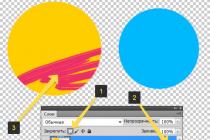
We can simulate RGB channel mixing ourselves. This is how I created most of the illustrations for this article. Draw ellipses on different layers, paint them with solid colors. Pure blue R0 G0 B255, pure green R0 G255 B0 and pure red R255 G0 B0. In the Windows Layers panel > Layers, change the Blending Modes of the layers to Screen. The Screen blend mode cuts off dark pixels, giving priority to light pixels. But besides that, it mixes different pixel tones just like it mixes their RGB color model.

I tried to write as concisely as possible, but the article turned out to be too voluminous. But now you fully understand how RGB channels work in Photoshop, and not only in Photoshop. They are arranged everywhere, the same way, believe me. I will develop the topic of channels in my next articles on this topic. In the following parts, I will describe channels in CMYK and Lab, as well as move on to their practical use in color grading and printing.
How to convert rgb to cmyk, Convert rgb to cmyk, Convert rgb to cmyk, How to convert rgb to cmyk in Photoshop, Convert color from rgb to cmyk, How to convert rgb to cmyk in Corel, Convert image from rgb to cmyk, How to convert rgb to cmyk to coreldraw, How to convert rgb to cmyk in illustrator, How to convert rgb to cmyk in illustrator, Photoshop cmyk, rgb translate.
Layers are currently the most powerful tool for working with photographic images. When you're editing a photo, whether it's in Photoshop or Paint Shop Pro, multiple image layers are essential. Sometimes more complex layers are used - custom, effects and masks based on layers. Layers are everywhere. And the question involuntarily arises - how users managed without them before.
The answer is simple - with the help of channels. You can easily tell a Photoshop veteran by the fact that he uses the Channels palette as often as he uses the Layers palette. But this should not be regarded as old-fashioned. Rather, it is evidence of professionalism, since the use of channels opens up great opportunities.
So what is a "channel". The standard definition - "a two-dimensional array of information, usually 8-bit" - is unlikely to clarify the situation. Therefore, let's take a closer look at the two main types of channels - color information and alpha channel - from the point of view of their practical application.
Color channels
The easiest way to see color channels in action is to use Photoshop's Channels panel. Open a regular 24-bit RGB photographic image. On the channels palette you will see 4 layers, each with its own icon: RGB, Red (red), Green (green) and Blue (cyan). If you click on RGB, you will see the image that you usually see - composite and full color. For each of the other channels, its grayscale version is displayed. Keyboard shortcuts Ctrl+1, 2, 3 allow you to view each of the color channels separately, and Ctrl+~ - a normal composite image.

The full spectrum of RGB colors is created from the red, green, and blue channels, where they are represented in gray scale.
To understand what information is displayed in the layers palette, it is worth observing the channels when working with a rainbow gradient test image (in other words, an image of all the colors of the rainbow). In the grayscale image that represents the channel, each of the pixels can display one of 256 values. You will see that the red part of the rainbow when viewed in the red channel will be white. The yellow stripe of the rainbow will be white in the red and green channels, but will be black, i.e. absent, in blue. In fact, the rainbow image shows that a full spectrum of 16 million colors can be obtained by combining values from 0 to 255 for red, green, and blue (256 x 256 x 256). In our image, the yellow bar corresponds to high values of the red and green channels and 0 to the blue channel. Photoshop works with an image not by individual pixels, but by channels. In this case, three eight-bit layers - red, green, blue - are superimposed, and we get the final image.
Of course, not all images are created in RGB, but this is not a problem, since the channels are very easy to adjust for different needs. We can convert our image to another mode using the Image> Mode command (Image> Mode). For Bitmap and Grayscale, there is only one channel representing 256 values from black to white. There are three channels in Lab mode: A (color value between green and red), B (between cyan and yellow), and L (brightness value). Separating a color from its brightness can be very helpful. Select a luma channel and convert it to a grayscale image. The result will be much better than if you converted the scanned RGB image.
The Lab color model can be very useful. But still the most important, after RGB, is CMYK. This model is print oriented. Convert rainbow image to CMYK. The first thing that catches your eye is a sharp change in some colors. The fact is that many pure RGB colors are not supported in CMYK. The second difference is that four color channels have appeared: Cyan, Magenta, Yellow, Black (turquoise, magenta, yellow, black). Look at the yellow stripe of the rainbow in the yellow channel - you will see that it is represented by black.

In the CMYK palette, the channels represent ink colors in multi-layer, four-color printing.
In this mode, there are significant differences from RGB, because Photoshop has to work with ink colors that are combined with each other in a subtractive way (when blending all the colors, it turns out to be black). In RGB, on the contrary, the principle of addition is applied, and the imposition of all colors will give white. But, by and large, all color models are similar to each other. And Photoshop can recreate the full gamut of any of them with up to four 8-bit channels, each with a maximum of 256 values (or 65536 values, if you really want to, and choose 16-bit channel from the Image > Mode menu).
Channels are the primary tool for working with color, so it's worth looking at the Channels panel occasionally to see how Photoshop creates different colors. This is especially true for working with the CMYK model, which is designed for printing. When working with RGB, what you see on the monitor does not always match what will come out when printed. Although the values of each of the channels reflect this. Moreover, if you want to replicate an image, you need to take into account factors such as dot blur and gray component replacement. This means that accuracy in working with color channels is very important, since color separation depends on it in the future.
Channels are useful for more than just CMYK printing. You will find a use for them in RGB as well. Let's say you can edit not the whole image, but a separate channel. When correcting color, it is worth looking at individual channels to identify defects in the scanned image. For example, if you find a blurry or shifted area in the red channel, you can correct this deficiency by using a sharpen filter or adjusting the levels.
And in order to create some special effect, you can apply an artistic filter to one of the channels. In any case, you can immediately see the result of your actions on the composite image - just make the RGB channel visible. Just don't forget to select the desired color channel again later if you continue to work on it.
The channel merging function provides a wide range of possibilities. For example, using the Apply Image command, you can overlay information from any channel of another image of the same size on the RGB channel of our image and customize this effect by changing the opacity and color blending mode. The Calculation command allows you to select two layers and create a new layer, selection, or document. If you use the "subtract" color blending mode, then areas of the image that have changed compared to the original will be selected.
With the advent of the Channel Mixer command and custom layers in Photoshop 5, the possibilities for combining channels have expanded. The channel mixer function is used only for individual images and allows you to customize each channel by adding information from other channels. With its help, you can create special effects, swap channels, correct color defects in scanned images. It is also ideal for creating "tinted" and high-quality halftone images (while you can control the conversion of each of the color channels to grayscale).

Channel blending is very helpful when converting color images to grayscale.
Adjusting colors using channels will undoubtedly come in handy. But the most common way to use them is to work with selections. Often, image elements are much more clearly visible in a single channel than in a composite image. For example, highlighting the bear in the bear.psd training file is much easier in the blue channel.
Alpha channels
Once you've created a selection, you'll probably want to save it. You can do this in the alpha channel. To do this, use the command "Selection> save selection" (Selection> Save Selection) or the icon "Save selection as channel" (Save Selection as Channel) on the channels panel. After that, a new channel appears, in which the selected pixels are displayed in white, unselected pixels in black, and blurry pixels on the border of the selection in shades of gray.
By double-clicking on a channel's icon, you can rename it and set the color it will display in the composite image. You can work with the alpha channel like any other, for example, adjust levels or apply filters. Moreover, you can edit this channel with a brush - for example, paint defects. When the result suits you, use it. To do this, convert the alpha channel to a selection using the "Selection> Load Selection" command (Selection> Load Selection), the "Load Channel as Selection" icon on the channels panel, or simply by clicking on the channel icon while holding Ctrl. If you have multiple alpha channels, you can create more complex selections. For example, you selected and converted to alpha channels an image of a person and bushes in the background. You can only select bushes if you select them and load the channel as a selection using the "subtract" option. Keyboard shortcuts will speed up this procedure: click on the icon while holding Shift+Ctrl - this will add a new area to the selection, Alt+Ctrl+click - will subtract from the selection, Alt+Shift+Ctrl+click - will give the intersection of two selections.

Alpha channels can be saved and loaded as selections.
Once you have converted the alpha channel into a selection, it will immediately appear on the screen and you can transform it, copy it to a new layer, or edit it in any way. The flickering dotted line along the edge of the selection does not accurately indicate its boundaries - you need to take this into account. It only renders the alpha channel pixels that have less than 50% gray. For most selections, this makes little practical difference. But the advantage of the alpha channel is that it allows you to work with 256 levels and thus create complex variable transparency masks.
How can these masks be used? Here are a few examples (it's actually easier to do than it looks when you read). Click on the "Create New Channel" icon and create an empty alpha channel, after that apply a gradient to it and select the composite channel again. Ctrl-click on the alpha channel icon. Now on the created selection, apply any artistic filter. Its effect will depend on the midtone values of the gradient mask. It will seem that the photograph is gradually turning into, for example, a painting.

The alpha channel can be used as a variable opacity mask.
Another example: create a copy of the alpha channel from the text selection and apply a Gaussian blur to it. After that, subtract the original channel (Alt+Ctrl+click) and you'll get a new channel that will display only the noise surrounding the text. Now select this area in the composite or any of the color channels. You can adjust the levels so that the selection glows, or even remove the original text and make the glow appear to be part of the photo.
You have the base, now experiment - you can create many effects using shadows, extrusion, vignettes, etc. Surely, if you take this seriously, the ability to save alpha channels with your file will come in handy. But the capabilities of Photoshop in this regard are surprisingly small - the program supports saving the alpha channel in a tiff file or in Photoshop itself (but the number of channels in a file, including color ones, is limited to 24). This won't be a problem if you only work in Photoshop. But the presence of an alpha channel can significantly affect the export of a file to one of the standard formats. For example, when saving for the Web in the dialog box that appears, you can use the alpha channel as a mask to adjust the quality and, accordingly, the size of jpg and gif files. Using the alpha channel, you can draw attention to a certain part of the image, which will be of the highest quality. The quality of the remaining areas of the image will deteriorate, but this will significantly reduce the overall file size. Alpha channels also come in handy when working with transparency. Create an alpha channel covering the area that should not be visible in the web version and Ctrl-click to select this area. Now call the Transparent Image Export Wizard and select gif. The selected area will become transparent in the final file, and you will be able to avoid making irreversible changes to the original. The wizard allows you to export an image to a png file that supports 24-bit color and 8-bit transparency. If you create an alpha channel with a radial gradient, you will get a vignette. Unfortunately, few programs support 32-bit png files with transparency. The only exception is, perhaps, Director 8.5.
Thanks to the ability to add color fills (spot colors) in CMYK, alpha channels are also useful for high-quality printing. Select the area of the image that you want to print as a color fill, and then use the command "new matte channel" (New Spot color) from the channel panel menu. When you set the color, click "Custom" (custom) and select a color, for example from the Pantone library.
Keep in mind that adding a color fill is not as easy as it sounds. The image on the screen, as you know, does not always correspond to what is printed. Ink colors are often impossible to represent in RGB, and Photoshop simply shows how it thinks the image should look when layered. If you save your file in DCS 2.0 format and load the composite eps image into a professional publishing program, you can make color separations for the four primary colors and custom color files you created.

The custom color channel allows you to display ink colors that are not part of the CMYK palette.
Without a doubt, channels play a very important role in photo editing, from adjusting colors and highlights to working with images for the web and high-quality prints. But time does not stand still, and layers often provide better results than channels. After creating a selection, copy it to a separate layer - and you can work with it independently, and if necessary, return to the original version. The same goes for many other effects that were previously created using channels. Now custom layers, effects, and layer-based masks do a better job of this task.
The channel system has also improved. So, although in many areas the channels are gradually being squeezed out of use, they are unlikely to disappear completely. At least for the simple reason that layers are based on channels. Strictly speaking, a layer is a set of independent channels of color information and alpha channels, one of which controls transparency, and the second acts as a layer mask. The same goes for custom layers, which are essentially alpha channels through which color is adjusted.
Photoshop, like any other photo editor, creates an image on the screen by processing the values from the color and transparency channels of the layer. And so, in turn, all the layers from the background to the foreground. Of course, actually working with an image is much more complicated - the program calculates color blending modes, opacity, settings, etc. But it is based on a step-by-step mathematical process. The program does not see the image, it works with the data array of each channel. Any photo editor "thinks" in categories of channels. This is a habit worth adopting as a professional user.
Next to the layers panel is another one - the panel Channels. Its purpose is to graphically display color information. Each channel is a separate component of the image.
So, what, in fact, is the meaning of this panel?
First, color channels contain information separated by color. For example, in the mode RGB The image is divided into 3 channels: red , green , blue , and for CMYK is 4 channels: cyan , magenta , yellow , black . Thus, we can highlight the fact that Photoshop does not distinguish the color itself, but finds it by filtering, by superimposing channels on top of each other.
Secondly, there are also alpha channels. Like color channels, they support 256, 65536, 4,294,967,296 shades of gray. But unlike color channels, they do not contain information and are opacity levels, masks. They can also be used as a selection of an area with subsequent saving (information about alpha channels is entered into the program, so memory is consumed, as a result of which the size of the source file increases).
Let's take a closer look at using channels in Photoshop using the following example. 
Go to the Channels panel - Window-Channels. We see a similar panel Layers, only channels act as layers, depending on the choice of display mode. We will use the mode RGB.
Here you can see 3 separate channels and 1 common:
RGB - combined channel, consisting of:
Red- Red, Green- green, Blue- blue color.
If we make a selection of the car and save it, then we will have a 4th channel: the alpha channel. As you already remember, this is a simple selection. 

Now let's see how the channels for individual colors look like and find out how you can use them. So, the red, green and blue channels in decreasing order are presented below. 
You may notice that the white color in the channel correlates with red when viewed in RGB mode. Those. if you take the tool Eye Drop Tool color from the hood of the car, then going into the panel Window Color we will see that the red color has a value of 255. Since we have it not red, but pink, the values of green and blue in the panel color will change. 


It remains to consider the right panel menu Channels the points.
In this tutorial, we'll learn how to enhance the contrast and brightness of images in non-standard ways by applying blend modes to individual color channels. If you're familiar with Photoshop, you'll certainly know that we usually select blend modes in the Layers panel when we want to change the interaction or combination of a layer with the underlying layer(s).
I'll show you how to apply blend modes not to the whole layer, but to the individual RGB color channels (red, green, and blue channels) that Photoshop uses to create a full-fledged color image.
How do we apply blend modes to color channels? In fact, doing this is simple and easy thanks to the "External Channel" (Apply Image) command.
Working with color channels in Photoshop is a bit difficult for a novice user. I will touch on it superficially in this tutorial, but for those who are just starting to work with channels in Photoshop, I strongly recommend that you read the tutorial first. "ModelRGB and color channels". After reading the material, you will better understand what will happen when you work further with the "External Channel" dialog box in this lesson.
To learn more about blend modes, I recommend that you check out the tutorial on blend modes, which explains how Photoshop's basic blend modes work.
For this tutorial, I'll be working with Photoshop CS6, but later versions will work too. Here is the photo I currently have open in the program:
original image
The first thing we need to do before moving on to further work with the image is to create a copy of it. If we look at the layers panel, we will notice that the original image is placed on the background layer (Background):

The layers panel shows that the image is placed on the background layer
Let's quickly make a copy of the background layer by pressing the keyboard shortcut Ctrl+Alt+J / Command+Option+J. This action will allow not only to create a copy of the layer, but also to pre-open the new layer dialog in which we can name the layer before adding it to the panel. Name the layer "External Channel" (Apply Image), then click OK to exit the dialog box:

New Layer Dialog Box
If we look back in the Layers panel, we can see that a copy of the image has appeared on a new "Outer Channel" layer above the Background layer. It's always better to give layers descriptive, "speaking" names, which we did, otherwise you can easily get confused with the common names that the program itself gives to layers, such as "Layer 1" (Layer 1), which will not tell us anything about the purpose of the layer:

A copy of the image appeared on the layer "Outer Channel"
As I mentioned at the beginning of the tutorial, we usually select blend modes in the Layers panel because we usually apply them to an entire layer. The blend mode button is located in the upper left corner of the layers panel. As an example, I'll now quickly change the blending mode of the "Outer Channel" layer from Normal (Normal) (set by default) to the mode "Soft light" (Soft Light):

Change the Blending Mode to Soft Light
Changing the mode shows the interaction of two layers - the "Outer Channel" layer and the background layer located below. The Soft Light mode belongs to the group of contrast enhancement modes, as it increases the contrast level of the entire image, which is what we see in our photo. The color saturation has also increased slightly:

Image after changing the blend mode to Soft Light
I'll change the blend mode back to "Normal" to bring back the original settings:

Changing the blend mode back to "Normal"
So, if changing the blend modes in the layers panel affects the interaction of layers in general, where is the work with individual color channels reflected and how to use blend modes for channels? In order to answer the first part of the question, we need to take a closer look at the layers panel. We will see that it is located next to two other panels - Channels and Contours (Channels and Paths), each of which has its own icon. Click on the Channels panel icon:

Click the channel bar icon
With this action, we will switch to the channels panel, where we can see the individual color channels: red (Red), green (Green) and blue (Blue), which make up our image. The RGB channel at the very top is not really a channel. It is the result of merging the red, green, and blue channels, or in other words, this is how we see a full-color image (each color in the image is made up of a combination of red, green, and blue):

In the channels panel we can find the individual color channels
We can select an individual channel by simply clicking on it. I'll click on the red channel to select it:

Red channel selection
Selecting the red channel temporarily disables the green and blue channels and allows us to see only the red channel in the document window. Photoshop displays color channels as grayscale images, and each channel is an image with different shades of gray. Here's what my red channel looks like in the document window. If you compare this version of the image with the full color image, you will notice that the areas containing red in the color image are lighter in grayscale rendering, while the areas containing little or no red are look darker.

Grayscale image after selecting the red channel

Green channel selection
The document window now displays the green channel as a grayscale image. Note that it is significantly different from the red channel. Again, if you were to compare this image with the color version, you would notice that areas with a lot of green appear lighter in grayscale, while areas with little or no green appear darker:

Grayscale image after selecting the green channel
Finally, I'll click on the blue channel in the channels panel to select it, which will temporarily turn off the red and green channels:

Blue channel selection
Now we have a blue channel in the document window, and again the grayscale image is different from the red and green channels. This time, the more blue an area in a color image contains, the lighter it is in a grayscale image, and vice versa, the less blue there is in an area of a color image, the darker the area in a grayscale image. As you select an individual color channel in the Outer Channel command dialog box shortly, don't forget these three versions of color channels, represented by grayscale images with varying degrees of grayscale:

Grayscale image after selecting the blue channel
To go to the full color version of the image, click on the RGB channel at the very top of the channel panel. This action will return all three color channels to work:

Mixed RGB channel selection
And we again see a full-fledged color image:

A full color image reappeared in the document window
Command "External channel"
Now that we know that the color channels are in a separate panel and each one is a halftone image, let's answer the second part of the question - how can we apply blend modes to them. You may have noticed that the Channels panel does not have a Blend Mode tab, unlike the Layers panel. We don't really need to work with the Channels panel anymore, so let's go back to the Layers panel by clicking on its name (Layers):

Switching back to the layers panel
To apply blend modes to individual color channels, we use the Outer Channel command. To do this, select the menu bar "Image" (Image) in the upper part of the screen, then from the list - "External channel" (Apply Image):

Choose Image > External Channel (Image >applyimage)
This action will open the External Channel command dialog box. If you have never worked with it before, then it may seem a little intimidating to you, but in fact everything is quite simple. In fact, we will use only two parameters - "Channel" (Channel) and "Overlay" (Blending):

Channel and Overlay options in the Outer Channel command dialog
The "Channel" parameter is responsible for selecting the channel that we want to use for work. By default, the RGB channel is selected, which, if you remember, is the blended channel located at the very top of the channels panel (the result of merging the red, green, and blue channels to produce a color image). The "Overlay" parameter is responsible for choosing the blend mode we need. If we leave the Channel option with the RGB channel selected and just change the blend modes, we get the same result as choosing the blend mode in the Layers panel. For example, I'll choose the blending mode "Soft Light" (Soft Light.) In the dialog box of the command "External Channel" (parameter "Channel" - RGB):

We leave the "Channel" parameter with the valueRGB and change the blending mode to "Soft Light"
You can clearly see that my image is no different than the one I got when I selected the Soft Light blend mode in the Layers panel earlier in our tutorial. The same increase in contrast and color saturation happened:

The Overlay option of the Outer Channel command works the same as the blend modes in the Layers panel when a channel is selectedRGB
But things get more interesting when, instead of the RGB channel, we choose any of the three separate color channels. I'll leave the blend mode set to Soft Light and change the Channel option from RGB to Red. This way, I will overlay only the red channel:

Red channel selection
This time the result is completely different from the previous ones. We still see an overall increase in contrast due to the Soft Light blend mode, but thanks to the interaction of the red channel's halftone image with the blend mode, we got a different effect. The girl's skin looks much lighter than before. The same thing happened to her hair, with a red top and areas of red, orange and yellow on the jacket. Essentially, everything that contains a lot of red in the image now looks lighter, while areas that contain little or no red, such as the blue and green area of the jacket, look darker than before:

The effect of the interaction of the red channel with the blend mode "Soft Light"
Let's see what happens if I change the Channel value to green (the blend mode is still Soft Light):

Switching from red channel to green
By selecting the green channel, we got another option for applying the effect. This time, the areas containing a lot of green are lighter, while the areas with a lot of red or blue are darker. The most distinct change occurred with the girl's skin, which became darker and more contrast than when choosing the red channel:

Green channel interaction with Soft Light blend mode
Now I'll change the value of the "Channel" parameter to blue:

Blue channel selection
In this case, we got the third version of the image, when the areas with blue became lighter, and the areas with red or green became darker. These effect variations wouldn't be possible (at least not without a lot of effort) if we didn't have access to working with individual color channels using the "Outer Channel" command:

Each color channel gives us its own way of applying the effect.
Of course, we are not limited to using only the Soft Light blend mode when working with our color channels. We can choose any of the blend modes, just like we would in the layers panel. I'll leave the value of the "Channel" parameter - "Blue" and change the value of the "Overlay" parameter to "Overlay" (Overlay):

Choosing an Overlay Blending Mode for the Blue Channel
Like the Soft Light mode, Overlay is a mode that enhances the contrast in the image, but to an even greater extent:

Blue channel interaction with Overlay blend mode
And here is how the work of the "Overlap" mode will look like when you change the channel to "Green":

Green channel interaction with Overlay blend mode
And here's what the red channel looks like in Overlay mode:

Red channel interaction with Overlay blend mode
The red channel image looks too saturated when interacting with the Overlay mode, but we can easily tone down the colors if needed by lowering the overlay's opacity. You'll find the Opacity option directly below the Blending option in the Outer Channel command dialog, and it works just like the Opacity option in the Layers panel. The default value of the parameter is 100%. I will reduce its value to 60%:

Decrease the opacity to reduce the intensity of the overlay effect
By lowering the opacity, we returned some of the highlights and shadows to the image:

The image after lowering the opacity of the Overlay blend mode
If you want to compare the processed and original images, just turn off the "Preview" option. » (Preview) located on the right side of the dialog box. This action will hide the applied effect and let you see the original image in the document window. Select the "Preview" option again to get back to working with the effect:

Turn on and off the "Preview" option to compare the original and processed images
You will often notice, especially when processing photographs of people, that the Soft Light and Overlap modes are the most successful for processing, but other useful blending modes are also worth trying, such as Screen (Screen) and Multiplication (Multiply) . Screen mode brightens everything in the image, while Multiply mode darkens everything. Try applying these modes to the three color channels to see the result, then adjust the intensity of the effect by increasing or decreasing the opacity value. For example, in my case, I set the Channel to green, the Blend Mode to Multiply, and lowered the Opacity to 40%:

"Channel" - Green, "Overlay" - "Multiply", "Opacity" - 40%
As a result, the image became darker and more detailed:

The Multiply blend mode works well for darkening an image. Try Screen mode to brighten it up
When you're happy with the result, click OK to exit the External Channel command dialog box. You can then again compare the processed image with the original one by clicking on the layer visibility icon (in the form of an eye) located to the left of the "Outer Channel" layer name in the layers panel. Click the icon once to make the layer temporarily invisible and view the original image. Click the icon again to make the "Outer Channel" layer visible again:

Turn layer visibility on and off to compare the final result and the original image
And so we did it! We've learned how to apply blend modes to individual color channels using Photoshop's Outer Channel command!